skip to main |
skip to sidebar
 I'm excited to present a website that I recently finished for Art on the Move - an initiative by Lakeshore Arts and Arts Etobicoke in Toronto. This 3-year project has professional artists working with community members to create 'moving art' - vehicles such as buses and trucks wrapped in art, instead of advertising.
It was so wonderful to be a part of this artistic initiative! The client wanted a very clean, easy-to-navigate website that matched the look of their logo. I've always loved the robin's egg blue and red combo, and was excited to use it here. Click here to take a peek at the website, and to see what Art on the Move is all about!


...a Frog Pod thingie from Boon in a draw at the Unionville Festival that P. and I attended on the weekend. I wasn't even sure what it was when they called, but I took a peek at Boon's website and it turns out it is this little bathtime toy scoop in the shape of a frog. I never win anything, so I was pretty excited, even though I'm not quite sure what to do with it quite yet!
However I was really impressed with the design of Boon's website - its clean style and fresh use of green, orange and light gray - right up my alley!
 What an adorable little website! So pretty and cute without going overboard on the cartoony.
 ...I am so pleased to announce that one of the websites I created with my old company has just won an award! The Jennifer Hayman Design Group was a Website Program Winner at Landscape Ontario last week. Take a peek! It is one of my favourite websites, and Jennifer's landscapes are absolutely breathtaking.
 I have a confession to make - I'm a web-o-phile. I could look on the internet all day for great designs, new trends, the latest ideas...and sometimes I do! I love the layered, textured look of this website. So organic!
It's funny how the 'green' or 'eco' trend of late can be applied to website designs too.
 I am so happy that I was a part of Green for Life's website project! Usually I design and program websites in Flash, however in this case I didn't create the initial design - but I programmed it, and added my design two cents here and there, in collaboration with the original designer. I think it turned out great - and I love the irony of how this waste management company has such a beautiful and clean website. Check out the rest of the site here.

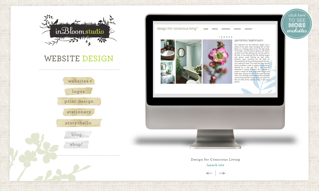
 I have been working on many websites lately, but the Design for Conscious Living website really was a joy. From the moment I met interior and landscape designer Celia, I knew we were on the same design wavelength! Her studio was beautiful - painted in greens and grays with dark wood accents, there were design books organized elegantly on bookshelves and a dream work/meeting table complete with funky stools. It was so natural and earthy, but sleek and sophisticated at the same time.
Each of Celia's rooms are inspired by nature, and pulled together with style. We created the same effect with her website - a very clean site, with hints of natural imagery, and colourful design elements. Be sure to check out Celia's portfolio. Needless to say, I would recommend her wholeheartedly!
 I'm very proud to showcase another recently completed website - Canvas Jam! This new company allows children to create abstract paintings on large-scale canvases that fit right into their parent's decor. Clicking through the photos, you can see just how proud all of these kids are, and what a great keepsake for parents {not to mention that they get a cool work of art for their walls}.
This company opted for a 'starter' one-pager website that includes some company information, photos, and contact details. As their company grows, they will be adding more pages to the site. And considering all of the photos I have added in the past month or two, it looks like they are well on their way! Be sure to check out the photos - the artwork is really quite beautiful and the kids, absolutely adorable.

 I want to share a recently-launched website that I created for Toronto make-up artist, Hayley Cotterill. Hayley actually did the makeup for my wedding last year and she performed a magical transformation on me from a nervous, rushing-around bride into a calm, beautiful blushing one! And what I really liked is that she didn't apply the typical heavy 'cakiness' that for some reason goes hand-in-hand with bridal makeup. I wanted to look fresh and natural, and Hayley achieved it!
Check out Hayley's new website - similar to the makeup look I was craving, Hayley wanted a simple, fresh, classy site that was both stylish but girly. I used of a lot of black and white, subtly infused with some girly colours of pink and aqua. A special horizontal scrolly gallery was added, as well as some damask 'wallpaper' in the background. The result - a cool and classy website for an equally cool and classy lady!
 Last year I created a logo {a funky 'inked' stamp motif}, business card, and stationery design for Alison Burke of the the Public Relations firm, Impressions PR. Alison just got her business cards printed on a thick white matte cardstock and they look amazing! It is really one of my favourite things to see how my onscreen designs translate onto paper, as I am a self-proclaimed paper nerd. I really love the vibrancy of the blue on the reverse side, and how the 'pr' is drawn out of the word 'impressions'. This card is a looker...
 So with her branding done, Alison and I set out to create a simple but informative website that matched the Impressions PR brand. Alison wanted a very stark, professional look {we used a simple, striking palette of black, white, and blue} but with some quirkiness {in the form of vintage black and white photographs} - and a beautiful site was born! Check out the recently launched website, www.impressionspr.ca - this is one of my new faves!
By the way, if you are in the market for PR, Alison is your gal! I worked with her on a PR campaign last fall and she was able to get our enviro holiday cards into many magazines across the country. She comes highly recommended and yes, does create some pretty darn great impressions.